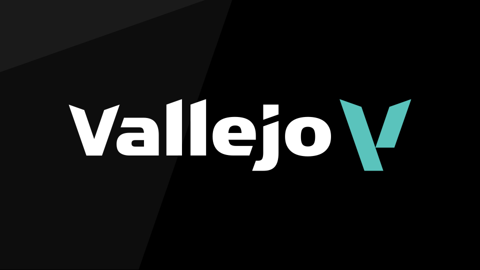
Vallejo, a leading company specialized in the manufacture of water-based acrylic paints, has repositioned itself and launched a new brand image.
In early 2020, Acrylicos Vallejo decided to change the company’s strategy, which is now beginning to see the light.
Since Amadeo Vallejo founded the company in New Jersey (USA) back in 1965 and before returning to Spain, the core of Vallejo’s business has always been the development of acrylic colors; from the late ‘60s for animation studios, through the first acrylics for fine arts manufactured in the ‘70s, to the first ranges for modeling formulated in the early ‘90s.
In 2022, Vallejo once again changes course to consolidate its position as the world’s benchmark in water-based acrylic paints. And it wants to achieve this by improving the formulation of its paints and establishing new emotional bonds with the customer. To this end, it has relied on the branding consultancy BrandStocker, which has been working on the company’s positioning, brand architecture, and visual identity since 2020.
“Leaving behind our old identity was a very difficult step to take, but in view of the results, we should have done it much earlier. We are no longer a black-and-white brand; we are a melting pot of colors… our leitmotif.” Alexander Vallejo, CEO Vallejo.
Vallejo is one of the few brands that manufactures its own acrylic paints; in fact, it has been doing so for more than 50 years. This makes it a unique source of experience and knowledge of consumer needs. In another sense, Vallejo has been historically a brand that was, and remains, present in the creative processes of many artists and modelers, being on many occasions a “catalyst” for their inspiration. For this reason, its new brand positioning is reflected in the tagline: “Inspiring Experience”.
“Vallejo atesora una experiencia que inspira, que estimula, que impulsa la creatividad y la imaginación. Es la experiencia que ilumina, que acompaña, que marca el camino. Con el nuevo posicionamiento pretendemos inspirar una experiencia única, una vivencia llena de sensaciones y emociones: El placer de la creación y la liberación de la imaginación”. Rubén Galgo, CEO de BrandStocker.
The core axis of the brand strategy stems from its main values: Know-how, Proximity, Experience, and Quality. Vallejo is perceived as a company that is close to its customers, due mainly to its wide distribution network. That is why the company’s main challenge is to be close; really close, that is, to establish relationships with its audience that go beyond the merely commercial.

Visually, the logo is now based on two colors, the traditional black (associated with quality and experience) and the greenish blue Lake Blue (appealing to know-how and innovation). If we focus on the logo, we can appreciate a customized typography, which has taken into account the imperfections and idiosyncrasies of a family company that have turned it into a worldwide benchmark. However, the most relevant aspect of the new visual identity is that Vallejo now has a symbol. The previous brand had a complex composition due to its square shape. This meant that the space was not well-used and presented readability issues in the digital environment.
“Vallejo is a surname, a surname with tradition, so it seemed appropriate that both the symbol and the logo should be a capital “V” that celebrates the legacy of the Vallejo-Safranek family”. Rubén Galgo, CEO de BrandStocker.
Since the brand territory is the inspiration, the symbol has been sought to be a reflection of it. The fact that Vallejo is one of the few paint brands that manufactures its own colors was singularity that had to be present in the new brand. One of the key tools of every paint manufacturer is the hopper (a cone-shaped container where paint is placed prior to the filling process). Who else but Vallejo could have a symbol inspired by a hopper of its own…? A symbol that is a container for creativity and inspiration.
Furthermore, the symbol is an abstraction of the gesture a hand does to load a paintbrush with paint. The concept of “container” is also present in the graphic universe (look & feel) and in brand architecture. While the parent brand is built with a Lake Blue symbol, the product ranges are in the traditional colors of each range.
The new strategy will be gradually implemented in Vallejo over the coming months and will affect all areas of the company: innovation, production, distribution, finance and communication. In short, these changes will be necessary to reinforce Vallejo’s position as the color of creativity for its consumers.
Vallejo,
inspiring experience


Comments (1)
To me, the most important info on the paint bottles is the name of the color and the being able to see the content.
I like that your bottles are now clear and show the color better. But you still have a huge label with black text on white ground covering most of it. I dislike this.
Also, you put the name of the paint range really big on there, but the name of the color is now at the sides? If photographed from the front, a lot of times I can only see half the English and half the Spanish name. That’s just frustrating when I look at pictures online! Please change that.